
 Sound Mill X3 : User's Guide
 Contents
 Language
 Product Home
Visual Attributes Editor
 Page Bottom
Overview
Visual Attributes Editor allows you to edit and save the visual presentation Attributes of an element. An element can be a Text Label, Text Box, Button, etc. Attributes not applicable to an element will not appear in the Editor. Figure 2 shows most possible attributes exposed for edit.
 To Page Top
Visual Attributes
- Name - The Name of the control. It may be used in selection lists. Not always editable.
- Text - Text string associated with an element (ex. Text rendered on the element). Not always editable.
-
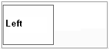
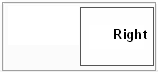
Anchor - Used to attach an element to one of the borders of its containing panel or table cell. Unlike Dock, this will not change the size of the control.
None
value will place the control in the center of its container. Set Dock to None when using the Anchor attribute.
Anchor: Left, None, Right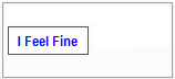
- Auto Size - When checked, the control size will be automatically determined usually based on Font size, padding and text length. When unchecked, the specified Size is used instead to manually size the element.
-
Border - Specifies the type of Border (aka outline) for the control.(See Figure 1.)
Border: FixedSingle
-
Background Image - Allows you to set a background image filename to be displayed on an element. The Delete button removes the image filename. Most common image formats are accepted (jpg, png, bmp, more...).
Background Image: Graphite button blank, Layout: Stretch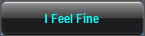
-
Background Image Layout - Sets how the image is aligned, stretched or replicated on an element.
Values:
Tile replicates the image as necessary to fill the control.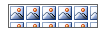
Stretch either stretches or shrinks the image to fill the control but does not maintain the image aspect ratio.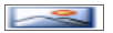
Center will center the image within the control.
Zoom enlarges (or shrinks) the image to the size of the control but maintains the image aspect ratio.
None , the image is top-left aligned within the the control.
-
Colors - A Color Group of Foreground / Background colors for the control. In Figure 2, a cross hatch background will show through the sample when Opacity is set to less than full Opacity (255). You can create custom color group or use a pre-created Favorite color. The Favorite Color button (yellow star) let's you quickly apply one of your favorite Color Groups. Also see Transparent Background below.
Color Group: White Foreground on Blue Background
-
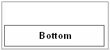
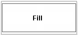
Dock - Used to attach an element to one of the borders of its containing panel or table cell. The control expands to fill the border dimension of the containing structure overriding the specified Size and Anchor attributes.
Fill
value will expand the control in size to fit the container.
Dock: Top, Bottom, Left, Right, Fill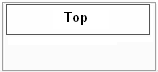
- Font - Font used to render the text of an element. If blank, a Windows default font is used. You can select any font available on your Windows system. The Favorite font button (yellow star) let's you quickly apply a pre-selected Favorite font.
-
Image - An image to be displayed on an element. This is sometimes an icon to be displayed next to the control's text. Or it can be the only visual item on the control. Most common image formats are accepted (jpg, png, bmp, gif more...).
Custom Button example: Text="Lion", Image="Lion.png", BackgroundImage="BlackGraphiteButtonBlank.png"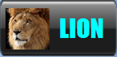
-
Image Alignment - Sets how the image is aligned within the control's text. This is useful when you are displaying an image next to text. (also see Text Alignment)
Image Alignment: Middle Left
- Image Size Mode - Sets how the image is applied to the control. (see Background Image Layout values for explanation)
- Location - A specific position in pixels ({X = horizontal, Y=vertical}) for the control within its container. The container may be the full screen dimensions or the position within a table cell (depends on the application). Some auto-formatting attributes (like Auto-Size or auto-Locate) may override this Location attribute.
-
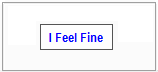
Margin - Spacing added outside of the element (See Figure 1.). The added space will NOT inherit the background color of the element. It is typically used to fine tune alignment of adjacent elements like text controls. When the control is Auto sized, it may affect how Margin is applied. The Set All button will set all four Margin values to one specified value.
Example A. (Margin Examples below) No Margin. All 3 elements have No Margin. Set to: {Left=0,Top=0,Right=0,Bottom=0}
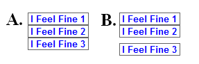
Example B. Element #2 has its Bottom Margin set to create line spacing. Set to: {Left=0,Top=0,Right=0,Bottom=8} -
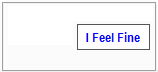
Padding - Extra spacing added inside the element itself. (See Figure 1.) The added space will inherit the background color of the element. It is typically used to fine tune alignment of text within the control. When the control is Auto sized, it affect the results of setting the Padding attribute. The Set All button will set all four pad values to one specified value.
No Padding: {Left=0,Top=0,Right=0,Bottom=0}
Padding: {Left=8,Top=4,Right=32,Bottom=16}
- Size - A specific size in pixels ({Width, Height}) for the control. Text or images may be cut off if the size is not large enough. When Auto-Size is true, it will override this Size attribute. A zero size ({Width=0, Height=0}) is ignored.
- Style - Sets the Windows style for an element. You can mouse over and click the sample button to see subtle differences in the styling.
-
Text Alignment - Sets how the text is aligned within the control. This is useful when you are displaying an image next to text. (also see Image Alignment)
Text Alignment: Middle Center
- Transparent Background - When true, the background color of an element will be totally Transparent. Any background color defined with the Colors attribute is ignored. This provides a convenient way to apply or ignore an element's background without having to use the Color Group Editor to change the Opacity value.
- Visible - Indicates whether or not to display an element (make it visible or invisible). Provides an easy way to hide a visual element temporarily without having to delete it.
Margin Examples
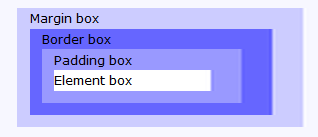
Figure 1. Margin vs Padding
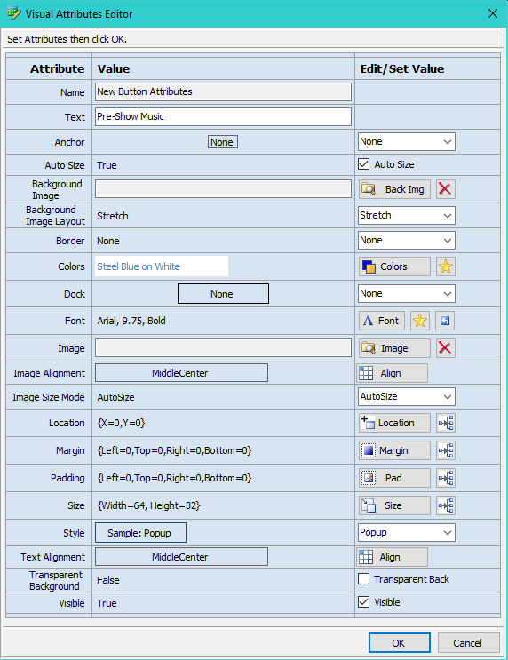
Figure 2. Visual Attributes Editor
Creating Extra Large Fonts
In the Windows Font dialog, there is a Size Listbox selector with standard sizes (see Figure 3, usually up to size 72). If you need a custom size, type the size number into the Size textbox above the Size Listbox selector.
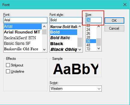
Figure 3. Windows Font Dialog
Free Fonts
There are tons of Free Fonts downloadable from the Web. Don't limit yourself to just what's installed with the standard Windows installation. Check out dafont or just Google Free Fonts.