
Marquee Style Editor
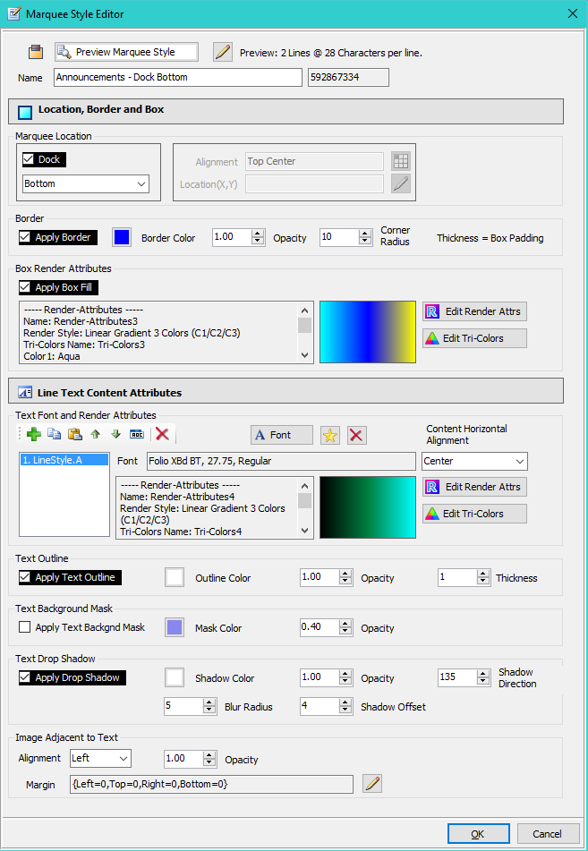
Marquee Style Editor (Marquee Style Editor) (Figure 3) creates visual styles that can be applied to any Marquee. You can create as many Marquee Styles as you like.
- Name/Id - Name identifier of the Marquee. Used for menu selections. Id is the unique id number of the Marquee.
Preview Marquee Style
The Preview Marquee Style button at the top of the Marquee Style Editor dialog will pop-up a preview sample window of the current style definition. This is simply a productivity aid to quickly see results of style edit changes.
- Preview Marquee Style - To see how the style will appear on a full size media screen, resize preview sample window to a desired size by dragging the lower right corner of the window.
- Preview Configuration - This button allows you to change the preview: 1) Number of lines displayed, 2) Number of characters per line.

Marquee Location
Defines where to locate the Marquee on the Media Screen.
- Dock - When checked, the Marquee is docked (stretched) across the entire side of the Media Screen. When unchecked, the Alignment is used.
- Dock location - Specifies which side of the Media Screen to dock to: Left, Top, Right, or Bottom.
- Alignment - Specifies which location on the Media Screen to position the Marquee. The Marquee Box is sized will fit the text given the font size used. Dock must be unchecked to enable Alignment controls.
- Location(X,Y) - When Alignment is set to 'Location(X,Y)', you can specify an exact pixel location of the Marquee on the Media Screen (X=Horizontal, Y=Vertical). The upper left corner of the Media Screen is location {X=0,Y=0}.

Samples
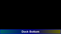
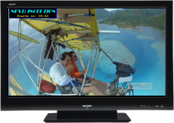
- A Marquee Docked across the bottom of a Media Screen.
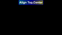
- A Marquee aligned to the top center of a Media Screen. Note that the aligned Marquee does not stretch across the side it is attached to. Aligned Marquees only take up the space needed for the text that they contain.
Border
- Apply Border - When checked, this feature is applied. When unchecked, these settings are ignored.
- Border Color - The Color button will reflect the effect of opacity on the selected color.
- Opacity - Sets the Opacity. (Range 0 to 1.0, 0=Full Transparency, 1.0= Fully Opaque, Solid)
- Corner Radius - Rounds the corners of the border. 0= no rounding, square corners, Non-0 sets rounding in pixels.
- Thickness - This value is sourced from the Box Padding value. Thickness in pixels on each side. Warning: Thickness of zero (0) produces NO border.

Samples
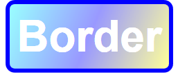
- A dark blue border with rounded corners.
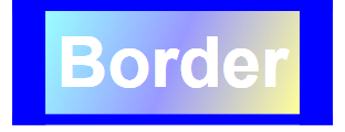
- Border sides with different thicknesses (Padding: {Left=30,Top=10,Right=30,Bottom=10}). This is set via the Box Padding in the Box Render Attributes.
Box Render Attributes
The Box is the retangular area inside the border that hold the Marquee Text Lines.
-
Apply Box Fill - When checked, the box is filled using the Render Attributes. When unchecked, the box is not filled and will expose the video behind the Marquee.
See the Render Attributes and Tri-Colors pages for capability details. - Margin - The Box Margin can be used to add extra spacing around the Text Lines effectively increasing the size of the Box. (values in pixels)

Samples
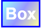
- Box with a Linear Gradient 3 Color fill. Opacity=0.4
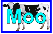
- Box filled with an image. Image Layout = Stretch.
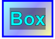
- Box size increased using Box Margins {Left=20,Top=20,Right=20,Bottom=20}. This adds spacing between the Box sides and the text.
Multiple Text Line Styles
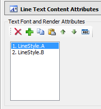
Marquee Style MUST contain at least one Text Line Style. Any Marquee line that does not have an associated Line Style, will inherit the visual attributes from the first defined Text Line Style (ie LineStyle.A in Figure 1). You can have multiple Line Text Line Styles. If you want your Marquee to have different styles for each line (ex. different fonts/colors on line1 and line2), you need to create a Line Style for each line. Text Line Styles are applied to Marquee lines in the order they are listed (Figure 1).
Use the Line Styles toolbar to manage the Line Styles. Add new Line Style, Copy a Line Style, Paste a Line Style, Move Line Styles Up/Down, and Delete the selected Line Style. The Auto-Rename button renames all the styles as LineStyle.A, LineStyle.B, etc.
Samples
- A Marquee with two lines. Each line has its own Text Line Style for different fonts and colors. LineStyles.A applies to the first line (top line). LineStyles.B applies to the second line (bottom line).
Text Font and Render Attributes
- Font - You can set the Line Text Font to any font on installed on your computer. Set the font size as needed. The font dialog allows custom sizes as well as standard sizes.
- Text Colors and Rendering - The Text Lines Colors and Render Style can be set in many ways. See the Render Attributes and Tri-Colors pages for capability details.
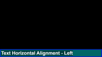
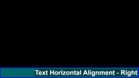
- Content Horizontal Alignment - When the Box is wider than the Text Lines (especially evident when docking the Marquee), you can align text to the Left, Center or Right. (see screen shots below)
- Padding and Margins - The Padding and Margins (in Text Render Attributes) can be used to add extra spacing around each Text Line (Padding) and between lines of text (Margins) to create space as needed. (values in pixels)
Note: Radial Gradients do not render on Text that have a Font Size less than 75 point. It will render as a Linear Gradient.

Samples - Text Render Attributes
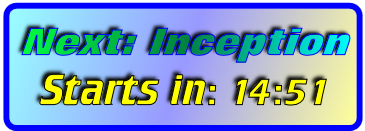
- The sample below shows the Text Font set to Cooper Black and the text colors set to a Linear Gradient 3 Color fill.
- Click this link to see text sample images that demonstrate some of the visual styles you can achieve with Text Render Attributes.

Samples - Content Horizontal Alignment
- Content Horizontal Alignment = Left.
- Content Horizontal Alignment = Right.
Text Outline
- Apply Text Outline - When checked, this feature is applied. When unchecked, these settings are ignored.
- Outline Color - The Color button will reflect the effect of opacity on the selected color.
- Opacity - Sets the Opacity. (Range 0 to 1.0, 0=Full Transparency, 1.0= Fully Opaque, Solid)
- Thickness - Sets the thickness in pixels.

Samples
- Outline Color=Black. Thickness=1

Text Background Mask
- Apply Text Background Mask - When checked, this feature is applied. When unchecked, these settings are ignored.
- Text Background Mask Color - The Color button will reflect the effect of opacity on the selected color.
- Opacity - Sets the Opacity. (Range 0 to 1.0, 0=Full Transparency, 1.0= Fully Opaque, Solid)

Samples
- Mask Color=Black, Opacity=0.4, No Text Padding.
- Mask Size surrounding the text can be increased by setting the Text Padding (in the Text Render Attributes). Text Padding: {Left=20,Top=20,Right=20,Bottom=20} in the sample image.


Text Drop Shadow
- Apply Text Drop Shadow - When checked, this feature is applied. When unchecked, these settings are ignored.
- Shadow Color - The Color button will reflect the effect of opacity on the selected color.
- Opacity - Sets the Opacity which softens the shadow effect. (Range 0 to 1.0, 0=Full Transparency, 1.0= Fully Opaque, Solid)
- Shadow Direction - The direction angle to project the shadow. (Figure 2, range = 0 to 360 degrees)
- Blur Radius - Creates a softening of the shadow. (typically close in value to the Shadow Offset)
- Shadow Offset - How far to place the shadow away from the original text. (in pixels)
Note: When Drop Shadow and Text Background Mask are used together, the shadow is created around the rectangle of the Mask rather than the Text. It creates a bevel effect to the mask.

Samples
- Shadow Color=Black. Shadow Direction=135

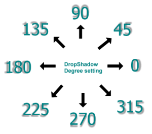
Image Adjacent to Text
- Alignment - Set where the image is aligned to the line text (Left or Right of the text).
- Opacity - Sets the Opacity which softens the shadow effect. (Range 0 to 1.0, 0=Full Transparency, 1.0= Fully Opaque, Solid)
- Margin - The Margin can be used to add extra spacing around the image if needed. Useful for space between the image and text. (values in pixels)

Samples
- Image Alignment=Left, Margin {Left=10,Top=0,Right=10,Bottom=0}

Marquee Size
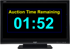
Marquee Size is calculated based on the factors below. Figure 4 and Figure 5 illustrate how font size will affect the area of screen real estate the Marquee will occupy.
- Number of Marquee Text Lines.
- Number of characters (letters) in a line.
- Font size in use.
- Various spacing values (padding, ,margins, etc).
 Page Bottom
 To Page Top