
Text Screen - Theme Editor
About Themes
Menu Locator: Media List Editor > Tools > Text Screen > Manage Text Screens .
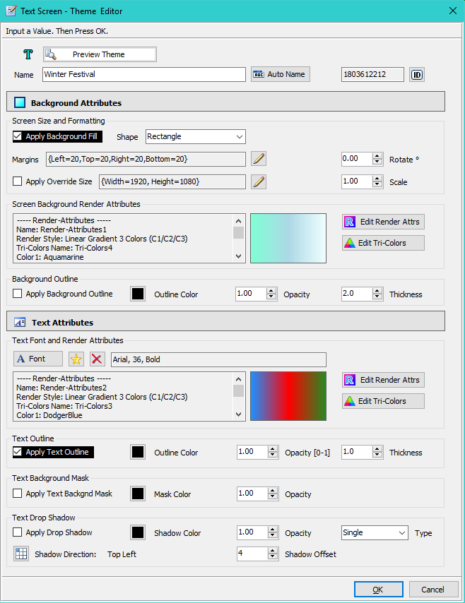
A Text Screen Theme is applied to a Text Screen to define its visual presentation properties. There is one Default Theme. And you can create any number of Theme Favorites via Tools > Text Screen > Manage Themes . Any Media Item that does not reference a specific Theme Favorite will use the Default Theme. The Theme Editor (Figure 1) allows you to modify the Default Theme or any Theme Favorite.
Productivity Tips
- There are a lot of settings here. While creating a new template, use the Preview button to see how each edit change affects the visual presentation.
- If you have different sized source text files, some with many lines of text and some with just a few lines, use the Duplicate button to make a dupilcate of a template. Then set the font size on each template according to the text file size.
Related Editors
Preview Theme
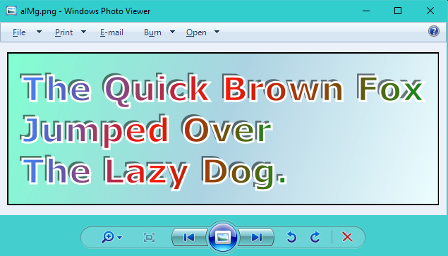
The Preview Theme button at the top of the Text Screen Theme Editor (Figure 1), will pop-up a sample Text Screen based on the current settings (Figure 2). The Preview App used for preview can be set/changed in the Options > Media Item - Text Screen tab. If you don't pick a preview app, the app that is associated with the PNG image file type will be used.
The Windows Photo Viewer app is a good choice for the Preview App because: 1) it is a light-weight viewer that pops up quickly, 2) it will open a new viewer window with each preview so you can compare different rendered Text Screens, 3) by right-mouse click, you can copy the image or open it with other image editing apps. The catch is that there is an extra setup step required for using this app (see the Knowledge Base article on using Photo Viewer).
Name/Id
- See Figure 1 for these settings.
- Name - Enter a logical name to help identify the theme. Name is used in several selection menus.
- Auto-Name - Will set the Name to the font family, font size and text color rendering style. Useful if you want to recognize themes by their fonts and text style.
- Id - If you accidentally delete a theme that multiple Media Items are referencing, you can create a new theme and set its Id to the Id of the deleted theme. That will resolve "Invalid Id" or "Not found" warning messages.
Text Screen Background - Size and Formatting
See Figure 1 for these settings.
How Text Screen Size is Calculated
The Text Screen is sized according to these conditions:
- Apply Override Size - When Apply Override Size is checked, the Override Size is used.
- When NO Text Screen Background Image is used: - Text Block Size plus the Margins is used.
- When a Text Screen Background Image is used: - Uses the larger dimension of: 1) Screen Background Image; 2) Or the Text Block Size plus Margins.
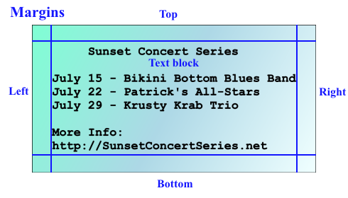
Text Block Size (Figure 3) is calculated based on: 1) the width of the longest line; 2) the number of text lines; 3) Font size line height.
Natural Media Size
The Text Screen Natural Media Size (Width, Height) is determined by how the Screen size is calculated (above). Thus the Natural Media Size will change whenever you change the theme: text font size; text contents of the associated text file; theme Margins.
Override Screen Size
- Override Screen Size - When Apply Override Size is checked, the screen size is set to the Override size (rather than being calculated based on font size, etc.). Any text lines that exceed the Override width are clipped, so you will need to pick a font size so that text falls within the Override Size.
Shape
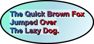
- Shape - Selects a shape for the background (Rectangle, Rounded Rectangle, Elipse). Elipse shape will require added margins if you want the text to fit totally inside the shape.

Rotate
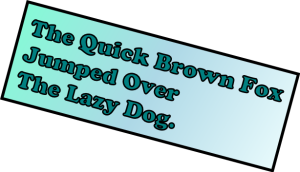
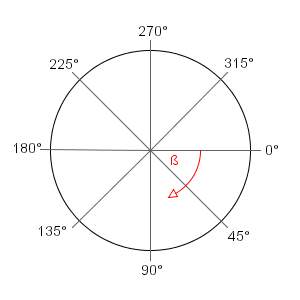
- Rotate - The Text Screen is rotated clockwise the specified number of degrees (range 0 to 360 degrees). Note: If Render Style is Image, the image will not be rotated within the Text Screen.
Rotated Text Screen: Sample below is Background Rotate: 15 degrees.
Notes: 0 degrees implies NO Rotation. The most useful values are in the Ranges 1-90 degrees (tilts Text Screen down) and 270-359 degrees (tilts Text Screen up).
Scale
- Scale - The Text Screen is scaled in size by the scale factor. Scaled elements include: Font Sizes, Margins, and Screen Size Override. Examples: Scale=1.0 no scaling; Scale=2.0 doubles the size; Scale=0.5 makes the Text Screen half sized. May be especially useful on high DPI displays (ex. 4K displays).
Apply Background Fill
- Apply Background Fill - When checked, the shape is filled based on the Background Render Style using the Tri-Colors. When unchecked, the background is left empty (regardless of Render Style setting).
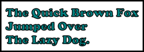
Text Screen with No Fill: Background Apply Fill : unchecked.
Provides a quick/convenient way to turn the Background rendering on/off as needed. Compare with the Rotated Text Screen above that has Apply Fill checked.
Margins
The Margin values add padding space around the entire block of text as follows (Figure 3).
Margins
- All values are in pixels. See Figure 1 for these settings.
- Left - Adds padding at the left. Allows you to center the text block horizontally. Increase this value to move the text block further towards the middle of the screen.
- Top - Adds padding at the top. Moves text block down. Allows you to center the text block vertically.
- Right - Adds padding on the right side. Extends the width of the text screen.
- Bottom - Adds padding at the bottom. Extends the height of the text screen.
Notes
- To indent a single line of text from the Left Margin, add spaces in front of the text. AVOID using tab characters for line indentation.
Screen Background Render Attributes
See the Render Attributes Editor for details on Render Attributes. Render Attributes include: Tri-Colors , Render Style, Origin Point for a Gradient, Opacity, Image File Name, Image Layout Style.
Render Attributes
- Edit Background Render Attributes - This button opens the Render Attributes Editor .
- Edit Tri-Colors - Click the Tri-Colors Editor button to edit Background Tri-Colors.
- Color Swatch - This swatch will visualize the Render Style and Tri-Colors currently selected.
Notes
- Background Image Size - A Background Image can be any size, but the closer it is to the display resolution, the crisper the rendered image will be. For full 1080p images you may be using font sizes of 48-point or larger. .
- Background Image Layout style - Stretch is generally the best choice for image layout. But there are always exceptions.
Background Outline
This will make a border around the Text Screen.
- Apply Background Outline - When checked, an outline is applied around the Background Shape.
- Outline Color - The color of the outline.
- Opacity - Opacity of the Outline Color. (range 0 to 1.0, 0=full transparency, 1.0= fully opaque)
- Thickness - How thick to make the outline (in pixels).
Background Outline / No Outline. Color=Black; Opacity=1.0; Thickness=10.
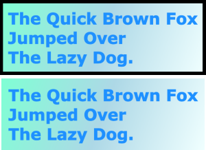
Thick Background Outline: Background Outline Color: orange; Background Outline Thickness: 30; Background Outline Opacity: 0.7
Note how the Outline Opacity (less than 1.0) allows the Background fill to bleed through and creates a two tone border effect.

Text Font and Render Attributes
See Figure 1 for these settings.
Text Font
Font
- Set Font button sets the font family and font size. Use a font point size of 28 or higher, for best quality results on most screens with up 10 lines of text. The font size you pick will depend on the amount of text you want to display (number of lines and length of lines).
- Pick from Favorite Fonts - A list of your favorite fonts is popped up for selection.
- Remove Font button will remove the font you have selected. A Windows default font will be used.
Font Considerations
- Font Size - For smoother text rendering on high resolution displays, pick a large font size. For 1080p displays, a font size of 48-72 point is recommended for smooth text rendering in most cases. If you are displaying lots of lines of text, you may need to lower the size somewhat. Using a font size that is too small will make the text appear fuzzy and or have jagged edges to some degree. Font size is dependent on the length of lines you are displaying and total number of lines.
- Custom Font Size - You can fine tune font size in the Font Picker dialog by entering a custom font size rather than picking from the preset sizes.
- Limitations - Almost all fonts are supported (99%), but there are a few esoteric fonts that do not work -- use the Preview button to test after a font change.
- Not Supported - 1) Underline and strike-through text; 2) Unicode characters.
Maintaining Text Alignment
If you want to maintain the same text column alignment as your source text file (ie. for columns of table data), use a non-proportional font for the Text Screen (ex. Courier). This is useful when you need to display tables of text that must align in columns. Many text editors use a non-proportional (monospaced) font. With non-proportional fonts, every character is the same width on the screen -- an "i" is the same width as a "W". If you then pick a proportional Text Font for the Text Screen, the alignment of your text will appear somewhat different on the Text Screen.
Text Render Attributes
Render Attributes
- Edit Text Render Attributes - This button opens the Render Attributes Editor .
- Edit Tri-Colors - Click the Tri-Colors Editor button to edit Text Tri-Colors.
- Color Swatch - This swatch will visualize the Render Style and Tri-Colors currently selected.
See the Render Attributes Editor for details on Render Attributes. Render Attributes include: Tri-Colors , Render Style, Origin Point for a Gradient, Opacity, Image File Name, Image Layout Style.
Text Outline
See Figure 1 for these settings.
- Apply Text Outline - When checked, an outline is applied to the text.
- Outline Color - The color of the outline.
- Opacity - Opacity of the Outline Color. (range 0 to 1.0, 0=full transparency, 1.0= fully opaque)
- Thickness - How thick to make the outline (in pixels).
Note: For thin fonts, Outline Thickness greater than 1 may produce poor results (letters totally filled with the outline color).
Examples: 1) Text Outline Color=black on light background; 2) Text Outline Color=white on dark background. Both examples use Outline Thickness=3.

Text Background Mask
See Figure 1 for these settings.
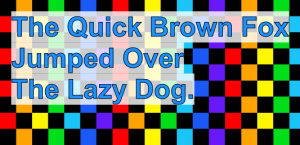
- Apply Text Background Mask - When checked, a Text Background Mask is applied behind the text.
- Mask Color - The color of the Mask.
- Opacity - Opacity of the Mask Color. (range 0 to 1.0, 0=full transparency, 1.0= fully opaque)
Example:
Text Background Mask. Color=white; Opacity=0.8
Text Screen Background. Render Style: Image; Image File: Checkerboard.png; Image Layout: Tile
Note how the Mask Opacity allows the Screen Background (Checkerboard) to bleed through the mask.
Text Drop Shadow
See Figure 1 for these settings.
- See Figure 1 for these settings.
- Apply Drop Shadow - When checked, text will have a drop shadow effect added.
- Shadow Color - The color used for the drop shadow.
- Opacity - Opacity of the Shadow Color. Lower values create a softer shadow effect. (range 0 to 1.0, 0=full transparency, 1.0= fully opaque)
- Shadow Offset - The Offset is the distance the shadow is offset from the text (in pixels, range 1 to 64).
-
Shadow Type
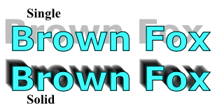
- Single - One descrete shadow is rendered at the Shadow Offset.
- Solid - A continous shadow is rendered. (See example below). To achieve a soft shadow when using Solid Shadow, you will need to set a low Opacity value (0.1 or lower). Solid Shadow with a Shadow Offset greater than 16 may produce a delay of a second or more to render the Text Screen.
- Shadow Direction - The direction that the shadow will be cast behind the text. Note that Direction = Middle-Center will map to Top-Left since Middle-Center position by definition would not produce a visible shadow.

Drop Shadow Types : Solid or Single. Shadow Color=Black; Opacity=0.25; Shadow Offset=10.
See note about Shadow Type Solid and shadow softness above.
Text Samples
Simple Single Solid Text: Text Render Attributes - Render Style: Solid Color (C1); Tri-Colors: C1-teal.
Literally any font on your computer can be used.

2 Color Gradient Text: Text Render Attributes - Render Style: Linear Gradient 2 Colors (C1/C2); Gradient Origin: Top Center; Tri-Colors: C1-blue, C2-light-blue Text Outline Color: black.

3 Color Gradient Text: Text Render Attributes - Render Style: Linear Gradient 3 Colors (C1/C2/C3); Gradient Origin: Middle Left; Tri-Colors: C1-blue, C2-red, C3-green; Text Outline Color: black.

Solid Text with Outline: Text Render Attributes - Render Style: Solid Color (C1); Tri-Colors: C1-green; Text Outline Color: blue; Outline Thickness: 3.

Text Outline Only (no fill color): Text Render Attributes - Render Style: Transparent; Text Outline Color: blue; Outline Thickness: 3.

Text Filled from an Image:
Notes: 1) You can use any image to fill the text. 2) The Image Layout value you use will alter how it is processed to fill the text.
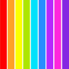
Example below: Render Style: Image; Image File: RainbowColors100.png; Image Layout: Tile; Text Outline Color: black; Outline Thickness: 3.

Rainbow colors image below was used to filled text above (RainbowColors100.png, 100px X 100px).
Theme Examples
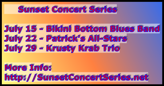
Listing 1 is the contents of the text file used for these sample Text Screens. Note that the first line has spaces added to the title line ("Sunset Concert Series") to indent the title. Use the Margins values to move the position the entire text block on the screen.
Listing 1. Text File Contents Example - SunsetConcert.txtSunset Concert Series July 15 - Bikini Bottom Blues Band July 22 - Patrick's All-Stars July 29 - Krusty Krab Trio More Info: http://SunsetConcertSeries.net
Theme with Background Image
- Text - Render Style: Linear Gradient 3 Colors (C1/C2/C3); Tri-Colors: C1=orange , C2=yellow, C3=red; Text Outline Color: black.
- Background - Render Style: Image; Outline Color: orange.
Notes: The sunset image used for this Text Screen is 1920x1080 pixels. The font size used was 72pt. The Text Block was centered on the image by setting Margins to {Left=100,Top=100,Right=20,Bottom=20}.

Theme with 3 Color Gradient Background
- Text - Render Style: Single Color (C1); Tri-Colors: C1=red; Text Outline Color: blue; Text Background Mask Color: white; Drop Shadow Color: black
- Background - Render Style: Linear Gradient 3 Colors (C1/C2/C3); Tri-Colors: C1=yellow, C2=orange, C3=blue; Outline Color: black;.
Theme with Tiled Background Image
- Text - Render Style: Linear Gradient 2 Colors (C1/C2); Gradient Origin Point: Top Center; Tri-Colors: C1=blue, C2=light-blue; Outline: black; Drop Shadow Color: black
- Background - Render Style: Image; Image Layout: Tile; Background Opacity: 0.5
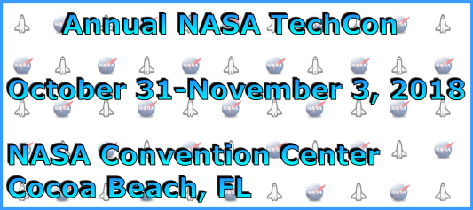
Image below was used to Tile (fill, wallpaper) the Background of the text screen above (black outline added to this image to demonstrate its dimensions).
 Page Bottom
 To Page Top