
 Sound Mill X3 : User's Guide
 Contents
 Language
 Product Home
Playlist Attributes Editor
 Page Bottom
Locator: Easy Player > Edit Playlist > Edit Playlist Attributes .
For cases where customers or visitors will be using the player (ex Kiosk), a great deal of flexibility is available for creating professional quality visual styling of the Easy Player. If you don't want to fuss with visual styling, most default values will be suffice.
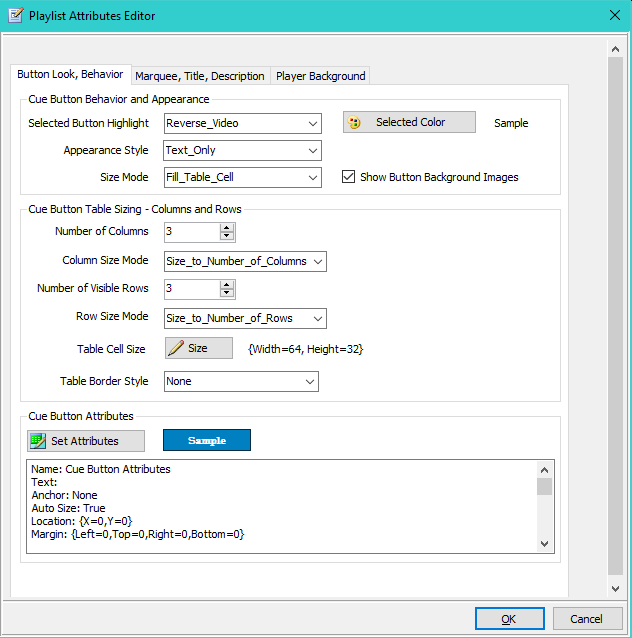
Cue Button Look / Behavior tab
The Button Look / Behavior tab is shown in Figure 2.
Cue Button Behavior and Appearance
Playlist buttons are arranged in a Cue Button Table on the Player (see Figure 5 ). These settings control the look and feel of the Cue Buttons.
-
Selected Button Highlight - When a Cue Button is clicked and becomes the selected (focused) button, it will be highlighted to indicate it is the active button. Also see the Player Options for setting the Highlight of the Current Playing Cue Button.
Values:-
Reverse_Video
, Cue Button foreground and background colors reverse.
Example: Normal button, blue text on white background , Reverse video
  .
. - Selected_Color_Default , uses the Selected Color for highlight. Use the Selected Color button to set/change this color..
- No_Highlight , no color change when control is selected.
-
Reverse_Video
, Cue Button foreground and background colors reverse.
-
Appearance Style - Determines how text and image is rendered on the buttons.
Values:- Text_and_Image , Both the text and an image (if an image is specified) are displayed.
- Text_Only , Only the text is displayed.
- Image_Only , Only the image is displayed.
-
Blank
, No text is display.
Custom Button Example: Appearance Style=""Text_and_Image"

-
Size Mode - Determines how Cue Buttons are sized.
Values:- Fill_Table_Cell , Cue Button expands to fill the table cell. This has the same effect as setting the Dock attribute to 'Fill'.
- AutoSize_to_Text , Cue Button is auto-sized based on Font size and text length.
- Use_Button_Size , The Size attribute is used to size the Cue Button. Text may be cutoff is if Size is too small.
- Show Button Background Images - When checked, it will display a custom backgound image on Cue Buttons rather than using the Colors attribute for button background. When unchecked, Background Images are not rendered on the Cue Buttons. Example: The Lion button above has a black graphite Background Image.
Cue Button Table Sizing - Columns and Rows
These values allow you to control how the Cue Button Table is sized and formatted. The Cue Button Table in Figure 5 has three columns and three visible rows of play buttons.
- Number of Columns - Set the Number of Columns for the table.
-
Column Size Mode - Determines how the column width is calculated.
Values:- Size_to_Number_of_Columns , Calculates equal width columns based on the width of the Player window.
- Use_Table_Cell_Width , Use the Width value from the Table Cell Size (see below).
- Number of Visible Rows - Set the Number of Rows that are Visible the Player window. Total number of rows is based on number of Cue Buttons divided by number of columns. A scroll bar appears when total rows exceeds the Number of Visible Rows. For example, Figure 5 has 3 visible rows. Note the vertical scroll bar indicating there are more Cue Buttons below.
-
Row Size Mode - Determines how the row height is calculated.
Values:- Size_to_Text_Height , Row height is set based on the Font height of the Text. 'Number of Visible Rows' value is ignored.
- Size_to_Number_of_Rows , Calculates equal height rows based on the 'Number of Visible Rows' value and the height of the Player window.
- Use_Table_Cell_Height , Use the Height value from the Table Cell Size (see below).
- Table Cell Size - Set a specific Width and Height for the Table Cell Size attribute.
- Table Border Style - Sets the type of border (or none) that outlines the rows and columns of the table.
Cue Button Attributes
Sets the visual Attributes used as defaults when creating new Player Cue Buttons. The Set Attributes button will open the Visual Attributes Editor. You can also propagate these values onto existing Cue Buttons when you make changes (see Apply 'New Button Attributes' to Cue Buttons) A Sample of current attributes is displayed to show some of the values.
Note on Font
All of the Cue Button Attributes can be changed on individual Cue Buttons. So for example, every cue could be a different color if desired. The exception is Cue Button Font. Every Cue Button will have the same font which is specified in these Cue Button Attributes.
 To Page Top
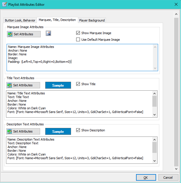
Marquee, Title, Description tab
The Marquee, Title, Description tab is shown in Figure 3.
The Set Attributes button for each of these sections will open the Visual Attributes Editor.
-
Marquee - Sets the visual attributes used for the Marquee Image. If you want to quickly create your own custom marquee image, we recommend the free, Cool Text Website.
- Show Marquee Image - When checked the Marquee will be rendered on the Player.
- Use Default Marquee Image - When checked, the Default Marquee Image is displayed rather than the Image set in the Attributes (if any). You can set your own preferred Default image in the Player Options dialog.
-
Title Text - Sets the visual attributes used for the Title Text.
- Show Title - When checked the Title Text will be rendered on the Player.
-
Description Text - Sets the visual attributes used for the Description Text.
- Show Description - When checked the Description Text will be rendered on the Player.
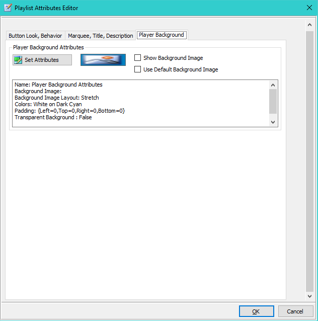
Player Background tab
The Player Background tab is shown in Figure 4.
The Set Attributes button will open the Visual Attributes Editor.
- Show Background Image - When checked the Background Image will be rendered on the Player.
- Use Default Background Image - When checked, the Default Background Image is displayed rather than the Image set in the Attributes (if any). You can set your own preferred Default image in the Player Options dialog.
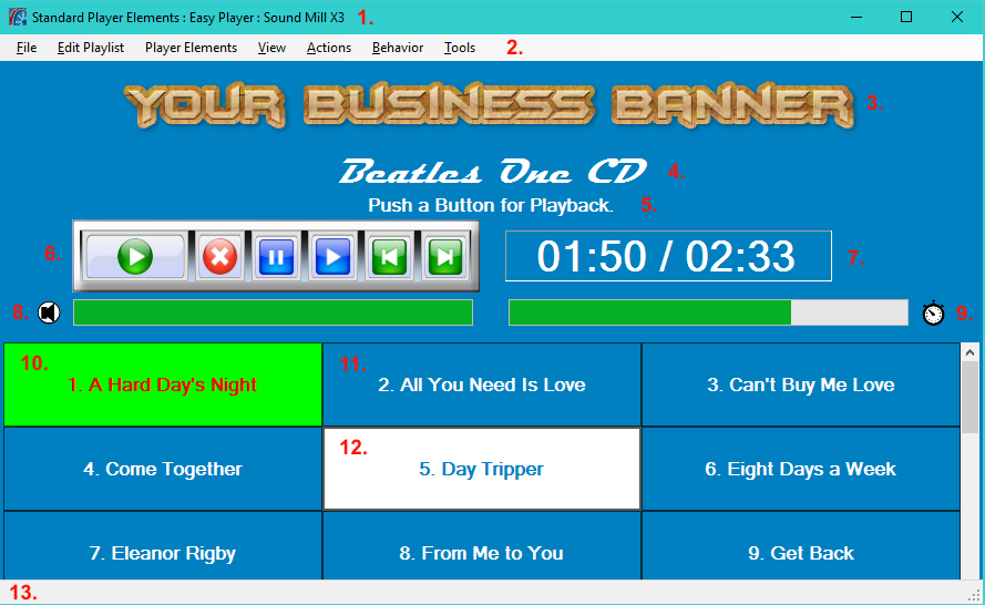
Easy Player Elements:
1. Window Title Bar;
2. Window Menu Bar;
3. Playlist Marquee Image;
4. Playlist Title;
5. Playlist Description;
6. Playback Controls Panel;
7. Playback Time Position Readout;
8. Volume Bar and Volume/Mute Indicator;
9. Playback Position Progress Bar and Playing/Paused Indicator;
10. Cue Button - Playing Cue;
11. Cue Button - Unselected;
12. Cue Button - Selected;
13. Window Status Message Bar.